I’ve been toying around with building a task and time mangament app recently. I’m using it as a way to get into learning a bit more about Svelte(Kit) and Tauri. I’ve also increasingly enjoyed using Tailwind and shadcn/ui for styling so I was quite happy to see that the project is being ported to other UI frameworks, including svelte’s port. However, something that is missing from both the svelte port and the original project are radial progress components. One great example I found was daisyUI’s implementation. I didn’t however want to add a new dependency just for a single component. So I decided to try my hand at building my own.
SVGs
One thing that there just is no way around is that this will involve working with SVGs. I’ve always liked the idea of working with SVGs because they are a compact and small way to bundle graphics and images, but I’ve not had a good reason/excuse to dig into them properly (not counting grappeling with D3). For this components (thankfully) we won’ have to dig intot the d property, but we will look at some SVG specific tags, namely circle and text.
The component
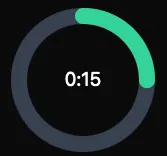
First of all I guess it would be helpful to showcase what the component will look like. Here it is:

This component consists of the following structure:
- the parent svg tag that wraps the whole thing
- the background circle (the one in gray)
- the foreground circle (the one in green)
- the text (displaying the time elapsed)
Circle
Let’s start with an overview of the circle tag and what the attributes are that we need to look into:
cx and cy
These attributes are pretty basic they dictate the respective axis coordinates of the svg. So if you think of them as coordinates on a traditional grid, it means that these coordinates dictate the point where the centre of the circle will be rendered they won’t affect the shape of the circle.
stroke-width
The stroke width simply determines how thick the line that draws the circumference is.
stoke-linecap
This property controlls how the beginning and end of the line around our circle get drawn, in our example we have these nice rounded parts.
fill
With this property we can set the color of the circle, but since we only care about the outline here we can set it to be transparent.
r
The radius. Pretty self explanatory.
stroke-dasharray
This is where things become not so obvious. This attribute is basically where much of the magic happens. It is used to
determine how much of the circle’s circumference should be shown as progressed or elapsed. It works in tandem with the
stroke-dashoffset property.
stroke-dashoffset
This property is what we use to animate the progress around the circle by shifting the line (from the stroke-dasharray) around
the circle. This gets done by setting an offset variable from the full circumference down to 0, the full circumference representing
no offset, so 0 seconds of elapsed time, and 0 representing no offset so the maximum time (it’s a bit counter intuitive I know).
Other properties
We will also need to calculate some other things that are not directly tied to the svg elements:
circumference: This gets calculated with the trusty formula.full: This is the maximum value that the progress should be able to reach. If we want to build a timer for example this would represent something like 5 minutes.dashOffset: This is the value we will use to move thestroke-dashoffsetaround the circle. It will animate the dash growth around the circle. The calculation is as follows: where is thecircumference, is the elapsed time, and is thefullvalue. The part in parentheses calculates the inverse percentage of the timer which we multiply with the circumference to get the correct value for thestroke-dashoffsetproperty- dynamic values for minutes and seconds: Since in my case I am using this component as a timer, I want to display the elapsed time
in minutes and seconds.
- minutes:
elapsed / 60 - seconds:
elapsed % 60
- minutes:
With these values we can build our full component:
<script lang="ts">
  export let elapsed: number;
  export let totalMinutes = 1;

  const full = totalMinutes * 60;
  const radius = 40;
  const circumference = 2 * Math.PI * radius;

  $: dashOffset = circumference * (1 - elapsed / full);
  $: minutes = elapsed / 60;
  $: seconds = elapsed % 60;
</script>

<div class="h-40 w-40">
  <svg class="h-full w-full" viewBox="0 0 100 100">
    <circle
      class="stroke-current text-gray-200 dark:text-gray-700"
      stroke-width="10"
      cx="50"
      cy="50"
      r={radius}
      fill="transparent"
    ></circle>
    <circle
      class="progress-ring stroke-current text-emerald-500 dark:text-emerald-400"
      stroke-width="10"
      stroke-linecap="round"
      cx="50"
      cy="50"
      r={radius}
      fill="transparent"
      stroke-dasharray={`${circumference} ${circumference}`}
      stroke-dashoffset={dashOffset}
    ></circle>
    <text
      class="dark:fill-white"
      x="50"
      y="50"
      font-size="12"
      text-anchor="middle"
      alignment-baseline="middle"
    >
      {Math.floor(minutes)}:{seconds < 10 ? `0${seconds}` : seconds}
    </text>
  </svg>
</div>

<style>
  .progress-ring {
    transition: stroke-dashoffset 0.35s;
    transform: rotate(-90deg);
    transform-origin: 50% 50%;
  }
</style>
Note: I added a custom class to animate the stroke-dashoffset, I know that Svelte has some nice built-in functionality
around animations, but I’m not yet too familiar with it so I decided to copy and paste do it this way. For the rest of
the styles I the default tailwind classes.